
Selected work
Custom typefaces and lettering, drawn from scratch for when off-the-shelf just won't do.



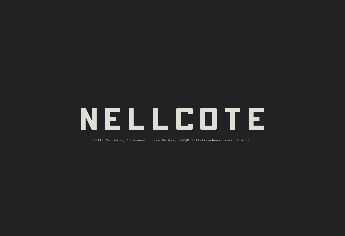
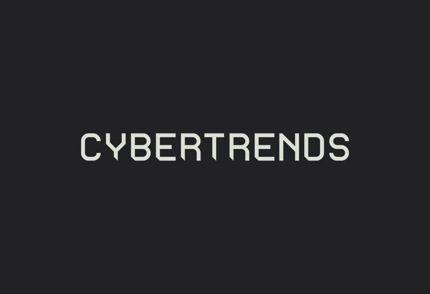


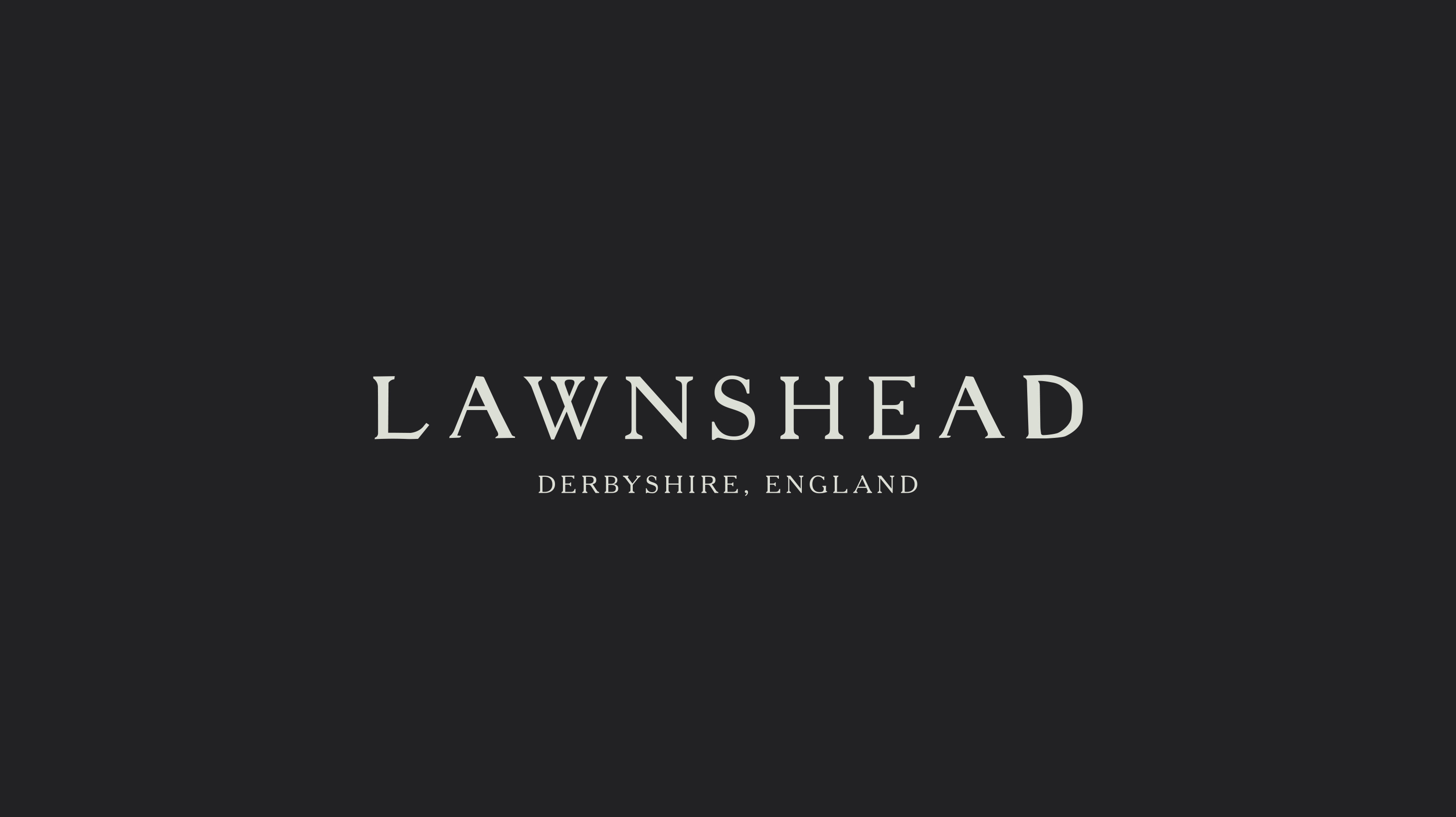



Why we draw type from scratch — and when it's worth it.
Type is the quietest part of a brand and the hardest to fake. An off-the-shelf font does a job; a drawn one does yours — carrying a voice, a period, a bit of attitude nothing else on the shelf has. So when a project needs to sound like itself, we draw the letters from scratch.
That runs from full working typefaces — spaced, kerned and built to set real text — to one-off logotypes and lettering made for a single title or sleeve. We've been cutting type since the Fontographer days, which mostly means knowing where to spend the effort and where a curve is close enough. If you've a job that needs its own letters, get in touch.
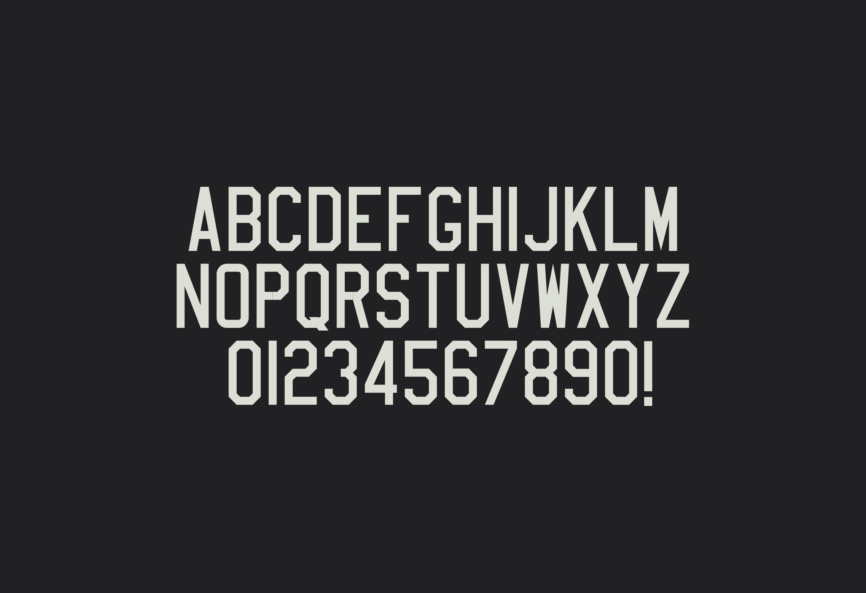
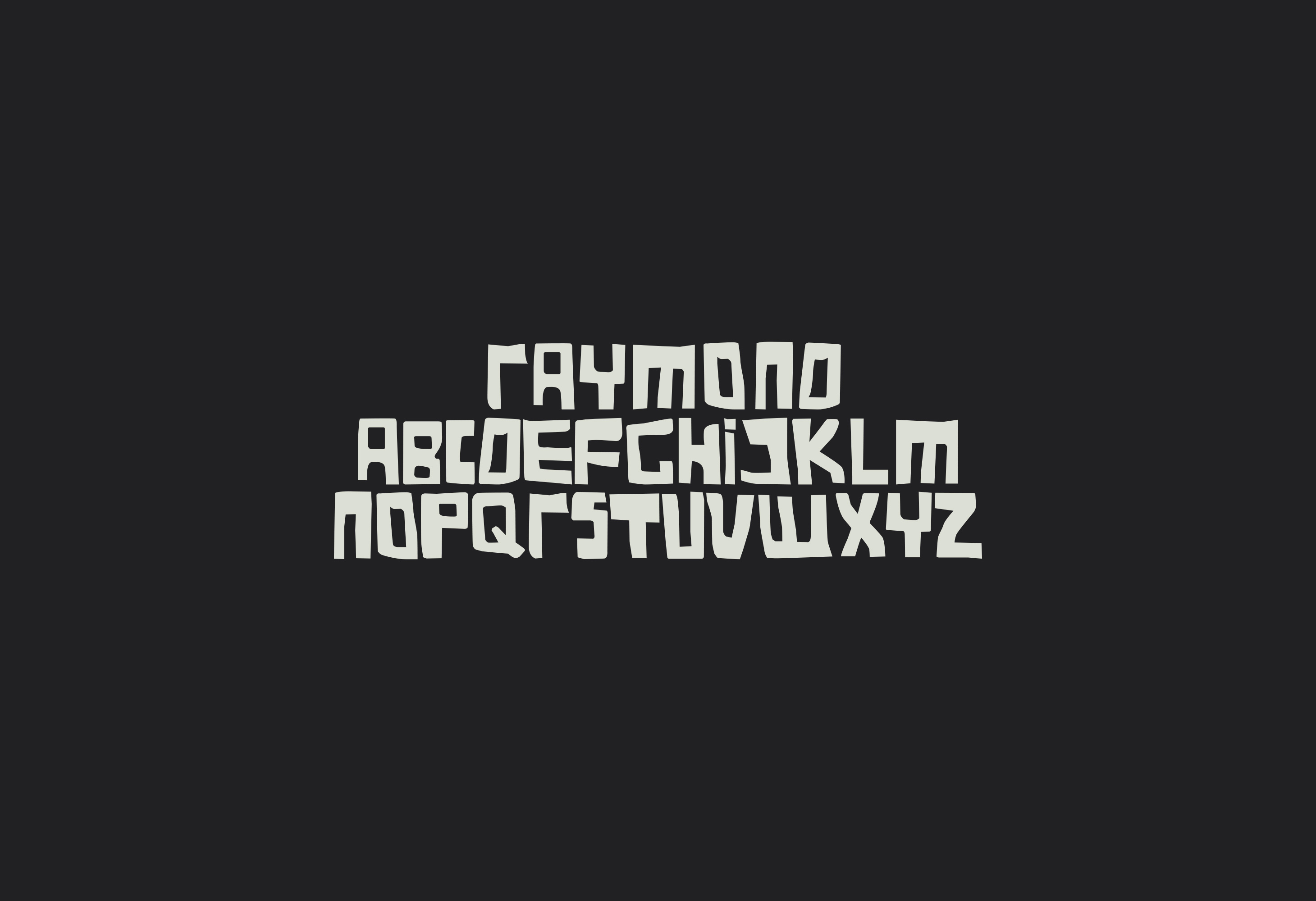
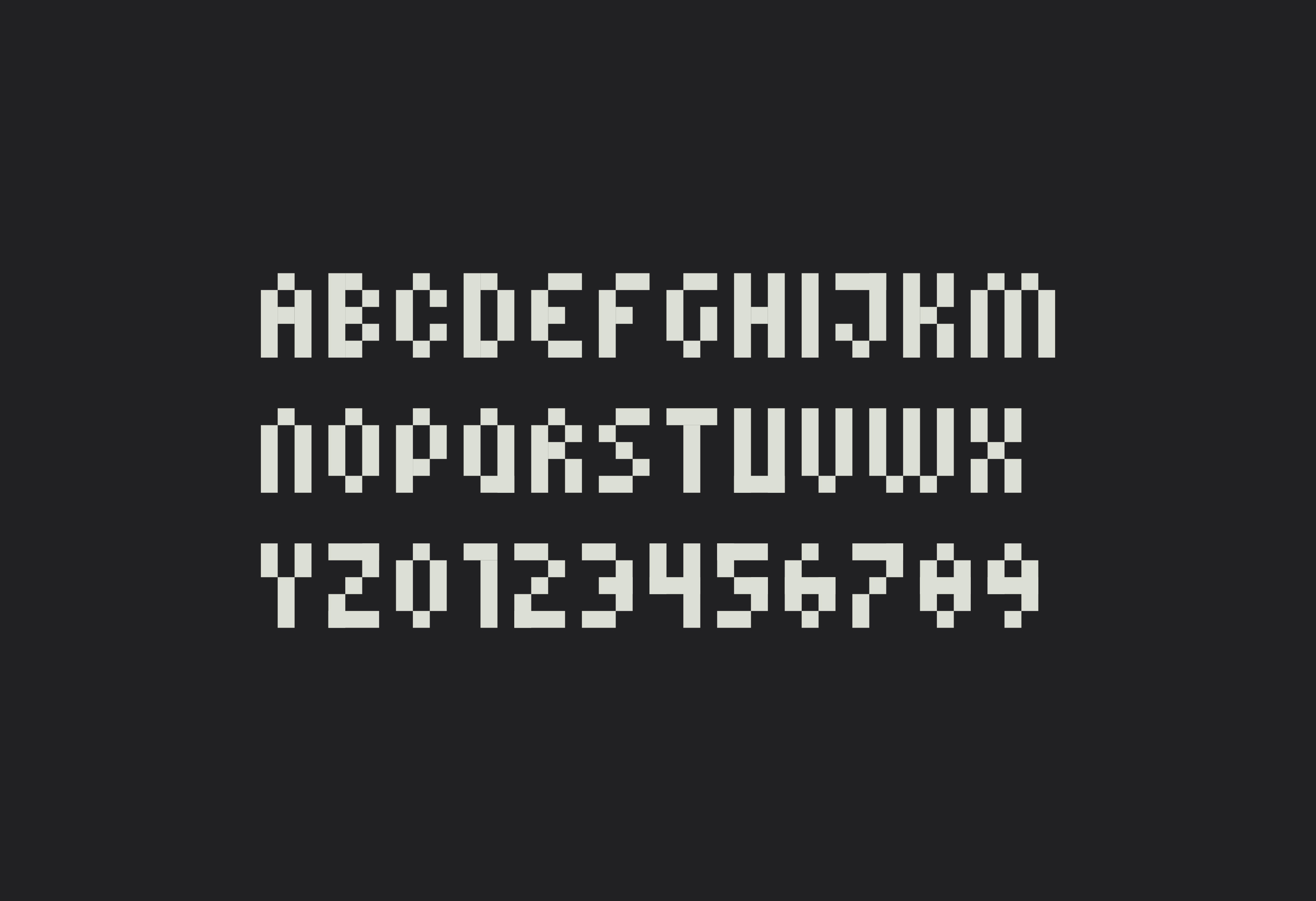
Complete working families, drawn and spaced from scratch — built to set real text, not just look good at one size.
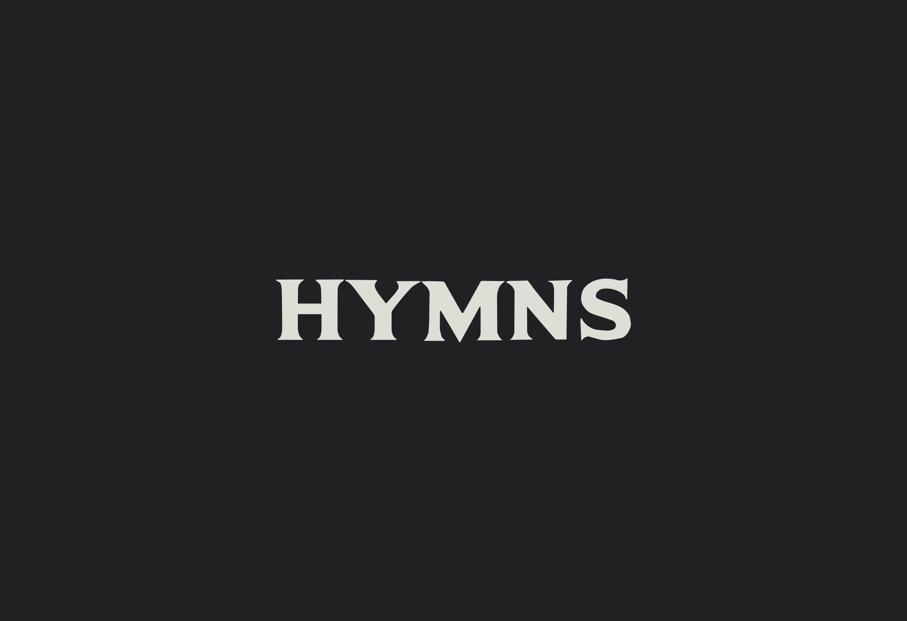
Custom wordmarks and one-off lettering, drawn to fit a single name, title or sleeve rather than bent out of an existing font.
↓ Services
Names, logos and complete visual identities. The whole toolkit a business needs to look like itself and nothing else.
Considered illustration in any register: the starting point elevated, never just executed.
Illustrated worlds and thematic maps, from hand-drawn journeys to data made legible.
Animation, motion graphics, title sequences, explainers and social. Ideas with a pulse.
Designed and built in-house. Sites and product UI that look sharp and actually work.
Custom typefaces and lettering, drawn from scratch for when off-the-shelf just won't do.
The design a product wears out into the world — every fold, finish and label reviewed.
Excellence in everything — every detail is deliberate.
Covers, campaigns and whatever else a title needs to find its readers.


