
↓ Series Titles — The Call of England
13 April 2026
↓ Details
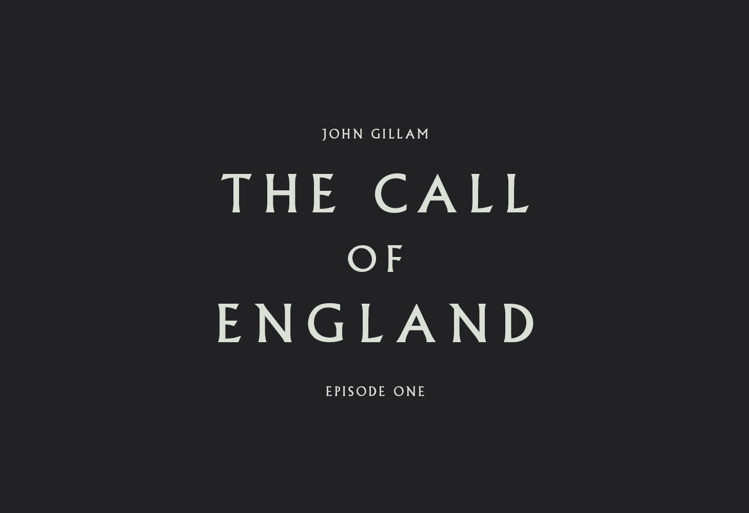
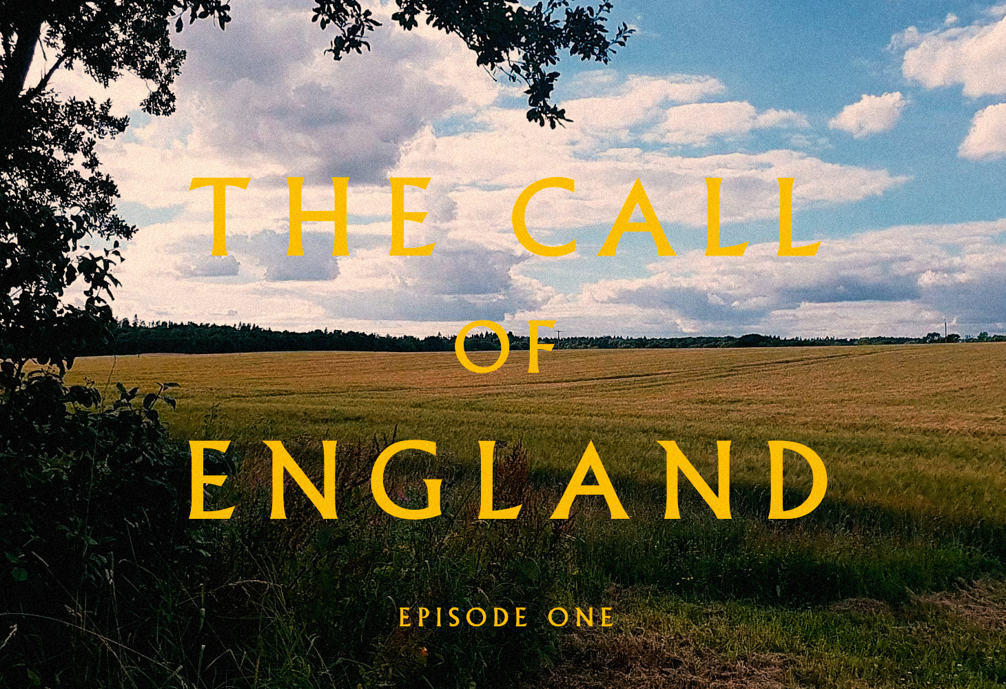
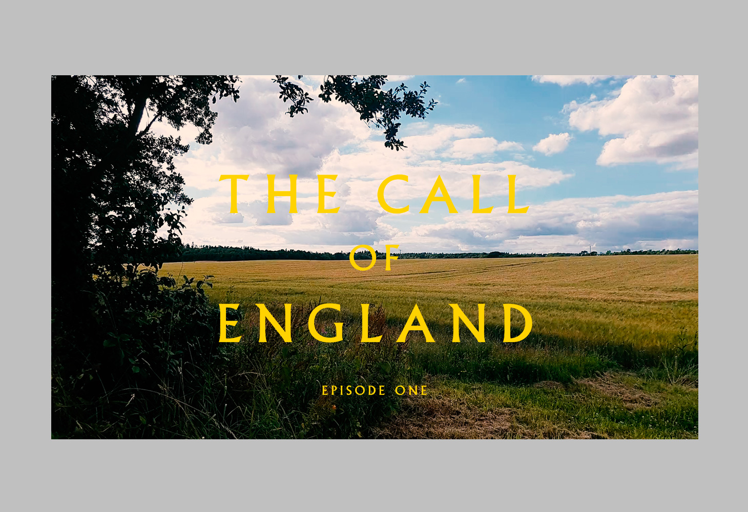
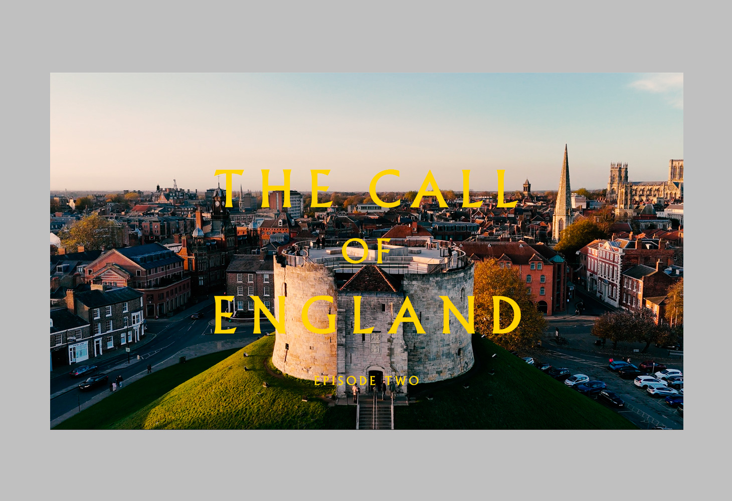
The recurring title sequence for The Call of England — John Gillam's film series travelling the country episode by episode. One quietly grand piece of typography opens every instalment: an elegant flared serif, letter-spaced and stacked, that settles into the landscape behind it.
Where the in-film place-name titles break each town into its roots, the series titles do the opposite job — they hold the whole show together across the run. The wordmark was built to work twice over: crisp and off-white on black for the cold open, then reversed into a warm signature yellow from the brand palette so it reads cleanly over drone footage of every kind — open countryside, hedgerow, rooftop and city skyline alike. Set and animated in After Effects with type drawn in Illustrator: restrained motion, no tricks, letting the words and the land do the work.
Client: Thinking Class
Any questions?
We’re just a click away.
If you would like to be added to the mailing list, enter your name and email below:
We are committed to protecting your privacy. We will only ever use this information lawfully (in accordance with UK data protection law, including the UK GDPR and the Data Protection Act 2018).