
↓ Native — Logotype
1 June 2025
↓ Details
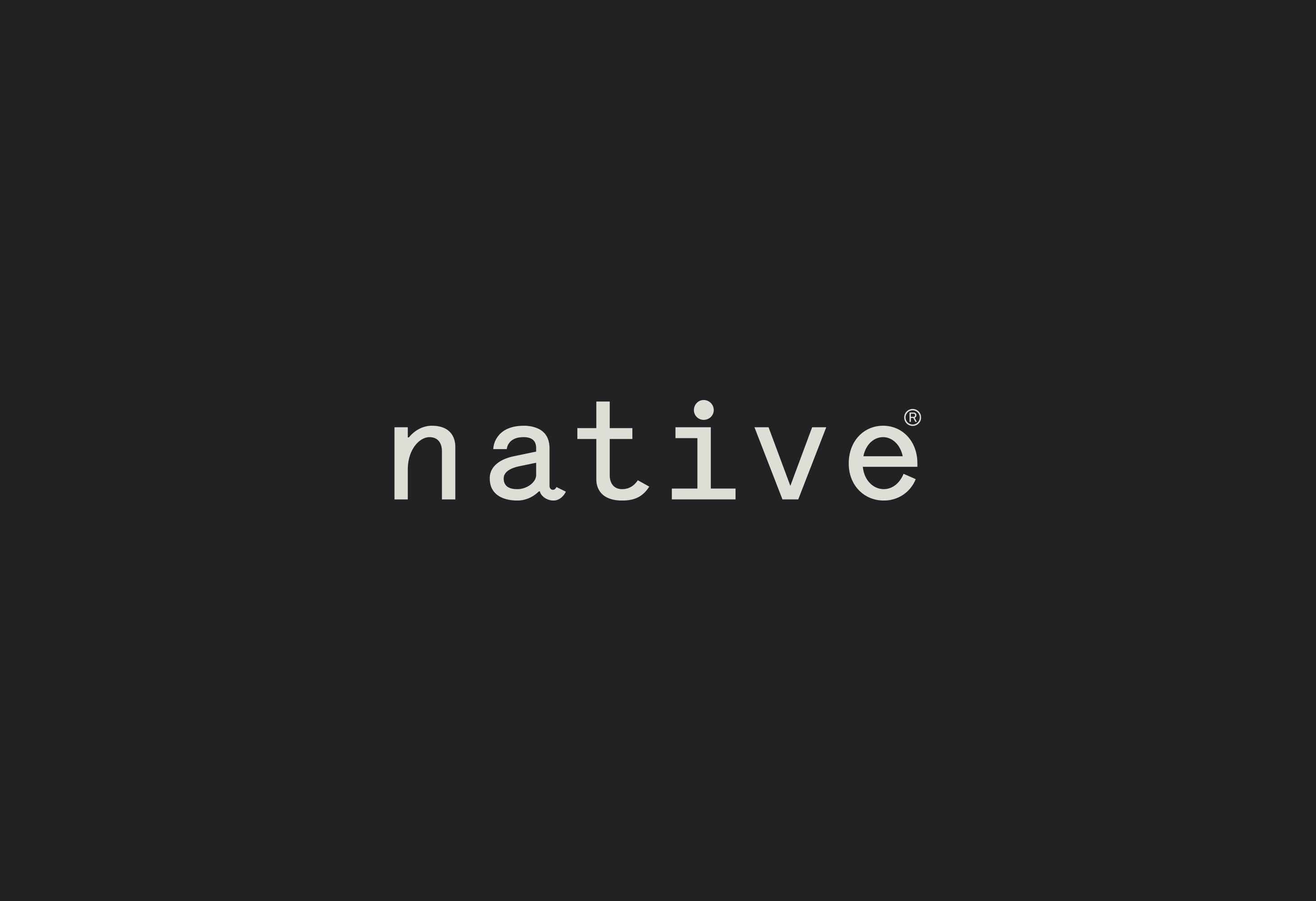
The mark sets the name in lowercase Lettera Std, the monospaced face that runs through the whole identity. The choice is the argument: a fixed-width, almost typewritten letterform reads as plain-spoken and unembellished — the visual equivalent of an honest ingredients list — which is exactly the reassurance a brand built on purity needs. No custom flourish, no drawn logo; just the name, set with care and given room to breathe. The registered mark sits quietly at the shoulder, and the dotted 'i' is the one soft, human note in an otherwise even rhythm.
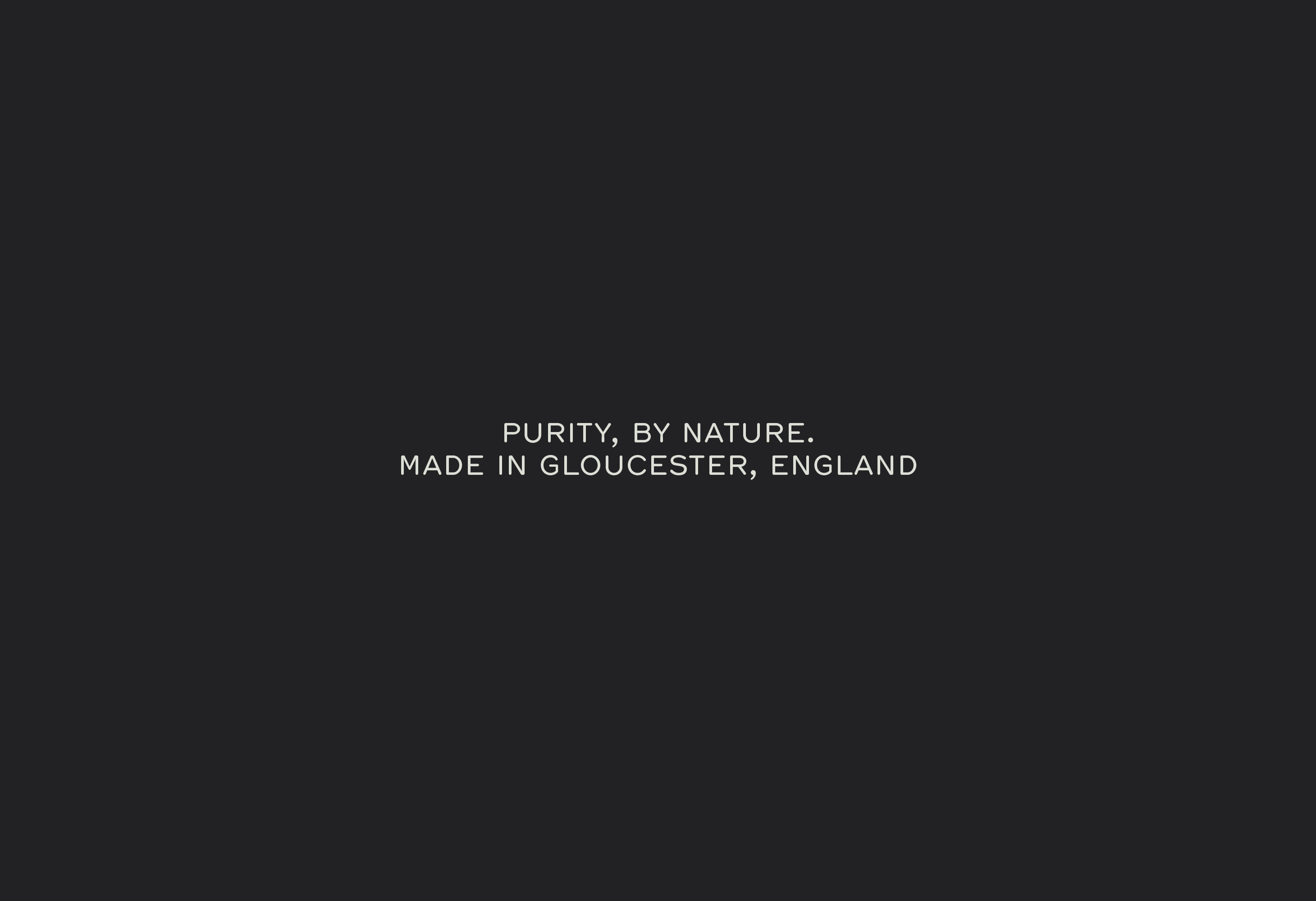
Beneath it, the strapline and origin line switch to Hermes — a clean sans set in wide-tracked caps. The pairing is deliberate: Lettera Std carries the name and the close detail work, Hermes handles the structural, spoken-aloud lines, so the two faces never compete. "Purity, by nature." states the promise; "Made in Gloucester, England" quietly earns it.
Presented on a near-black ground, the logotype holds its own with nothing else on the page — which is the whole point of the system: say less, and mean it.
Client: Native
Any questions?
We’re just a click away.
If you would like to be added to the mailing list, enter your name and email below:
We are committed to protecting your privacy. We will only ever use this information lawfully (in accordance with UK data protection law, including the UK GDPR and the Data Protection Act 2018).