
↓ Expelled — Dr Bella D'Abrera
1 October 2025
↓ Details
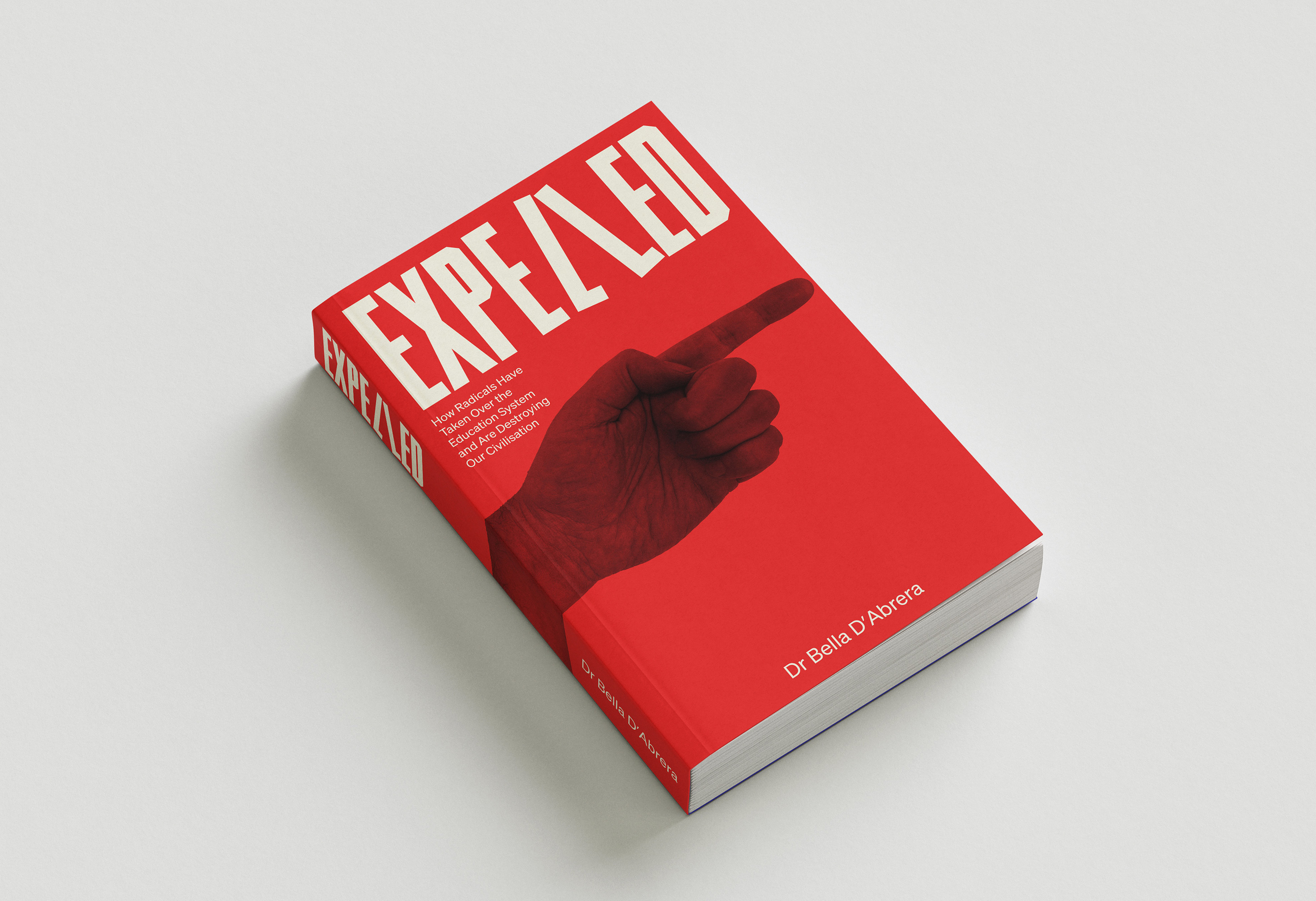
Expelled makes an uncompromising argument, so the cover had to carry the same conviction. The whole design turns on a single idea: expulsion. A hand points off the edge of the cover — the teacher's gesture toward the door, "you're expelled" — rendered as tone in the red so it reads as a threat rather than a photograph.
The wordmark carries the same joke with a straight face. The two L's in "Expelled" are drawn as legs with feet, mid-stride — the walk of shame out the door. It's the kind of detail you notice a second after the title lands, and it does the book's argument in one glance. Set in a warm off-white against a flat, urgent red, the type holds its own without a second colour.
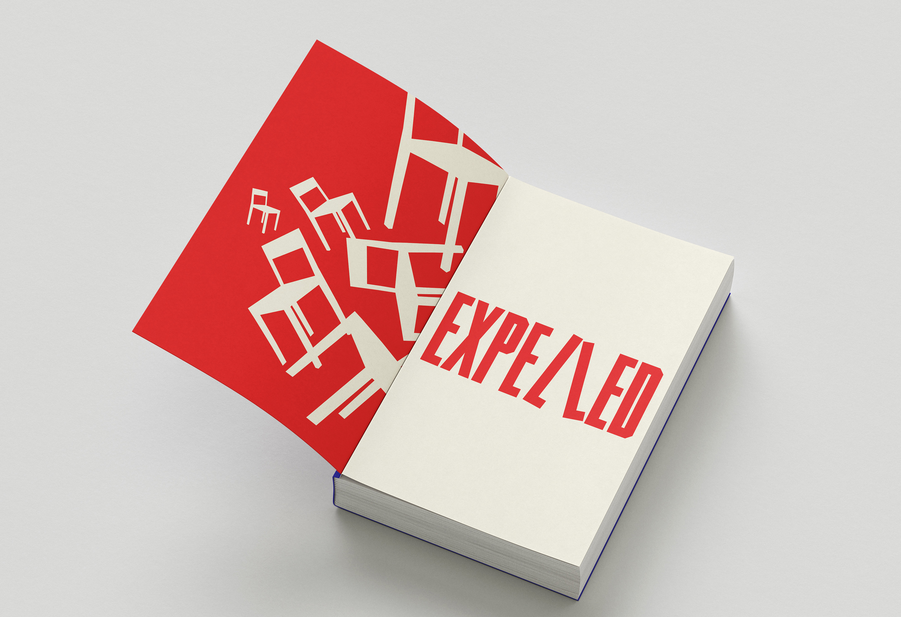
Inside, we carried the same restraint through: one accent, generous margins, a clear typographic hierarchy for a text-led book, and running heads and chapter openers that pick up the cover's letterforms without repeating them. The spine and back were designed to work as hard as the front, since this is a book that will spend most of its life seen edge-on.
Client: Dr Bella D'Abrera
Any questions?
We’re just a click away.
If you would like to be added to the mailing list, enter your name and email below:
We are committed to protecting your privacy. We will only ever use this information lawfully (in accordance with UK data protection law, including the UK GDPR and the Data Protection Act 2018).