
↓ DMSO Eye Drops — Native
5 September 2025
↓ Details
Native came to us as a rebrand. The range — colloidal silver, DMSO, magnesium oil and other high-purity remedies — had built a loyal following under a name that leaned into the fringe. The goal was to keep the substance but shed the fringe: a clinical, premium identity that a mainstream buyer would trust on sight.
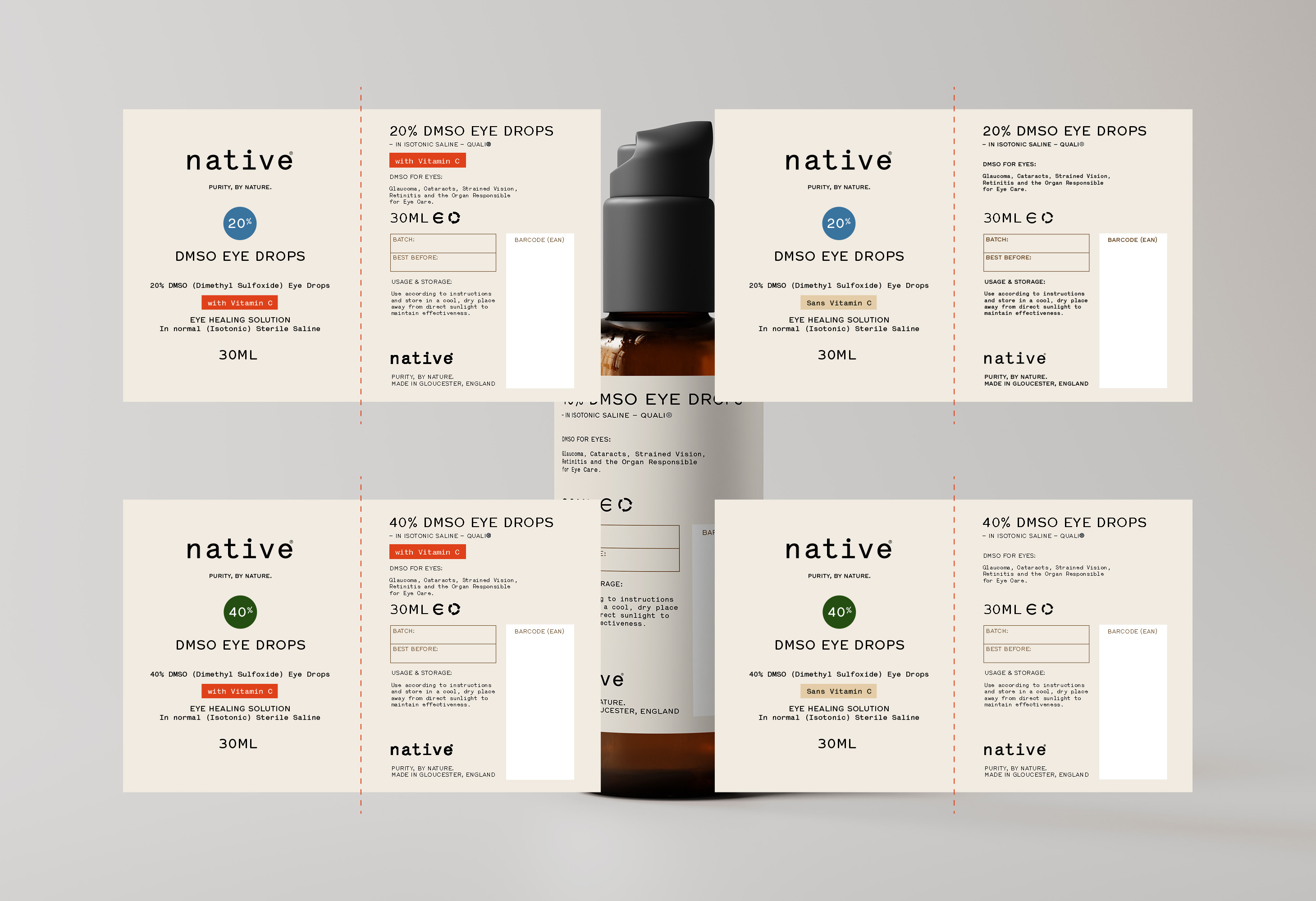
We built the new brand around a single idea — purity — carried in the name, the wordmark and the line that sits beneath it, "Purity, by nature." The label system takes its cue from a pharmacy dispensary rather than a wellness shelf: a warm off-white stock, a monospaced wordmark, and typography that reads as considered and honest rather than shouty.
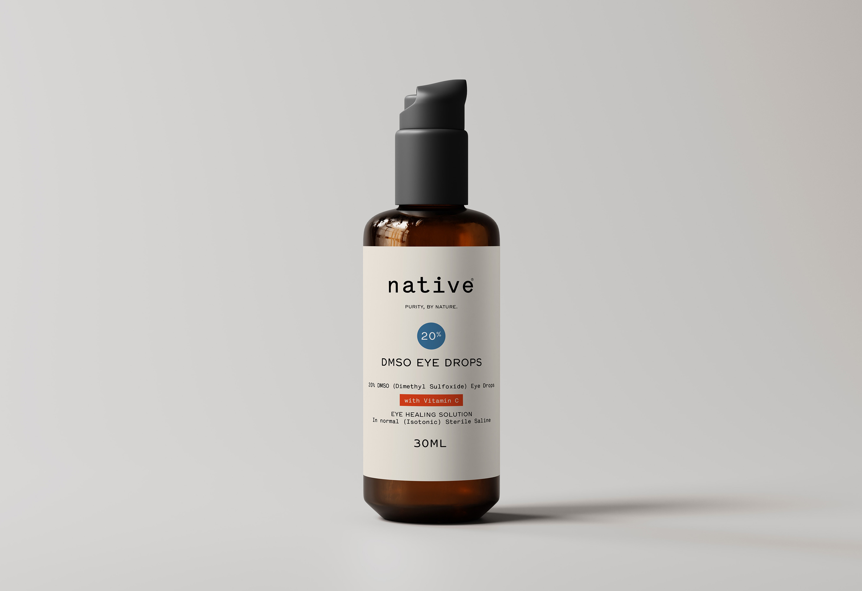
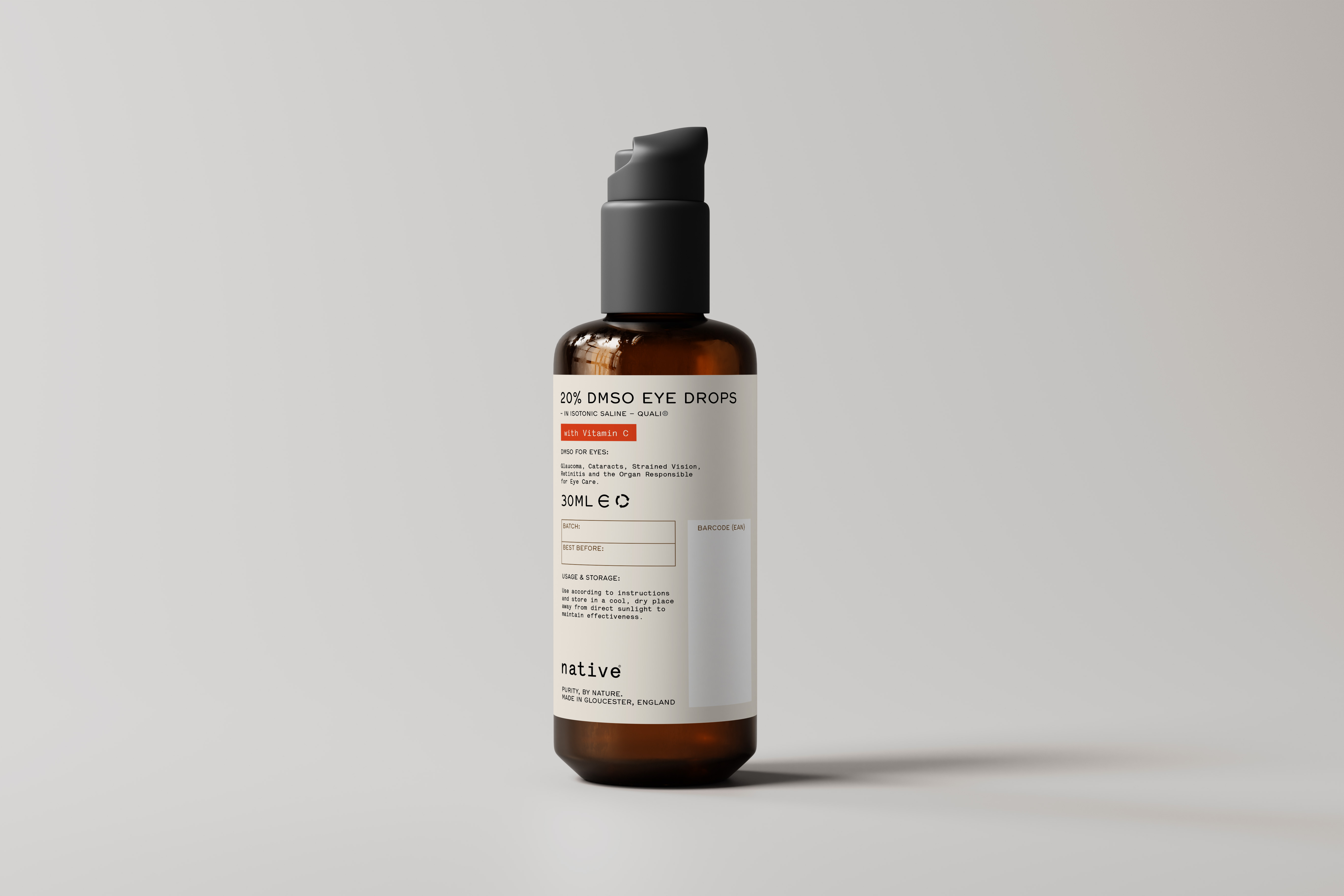
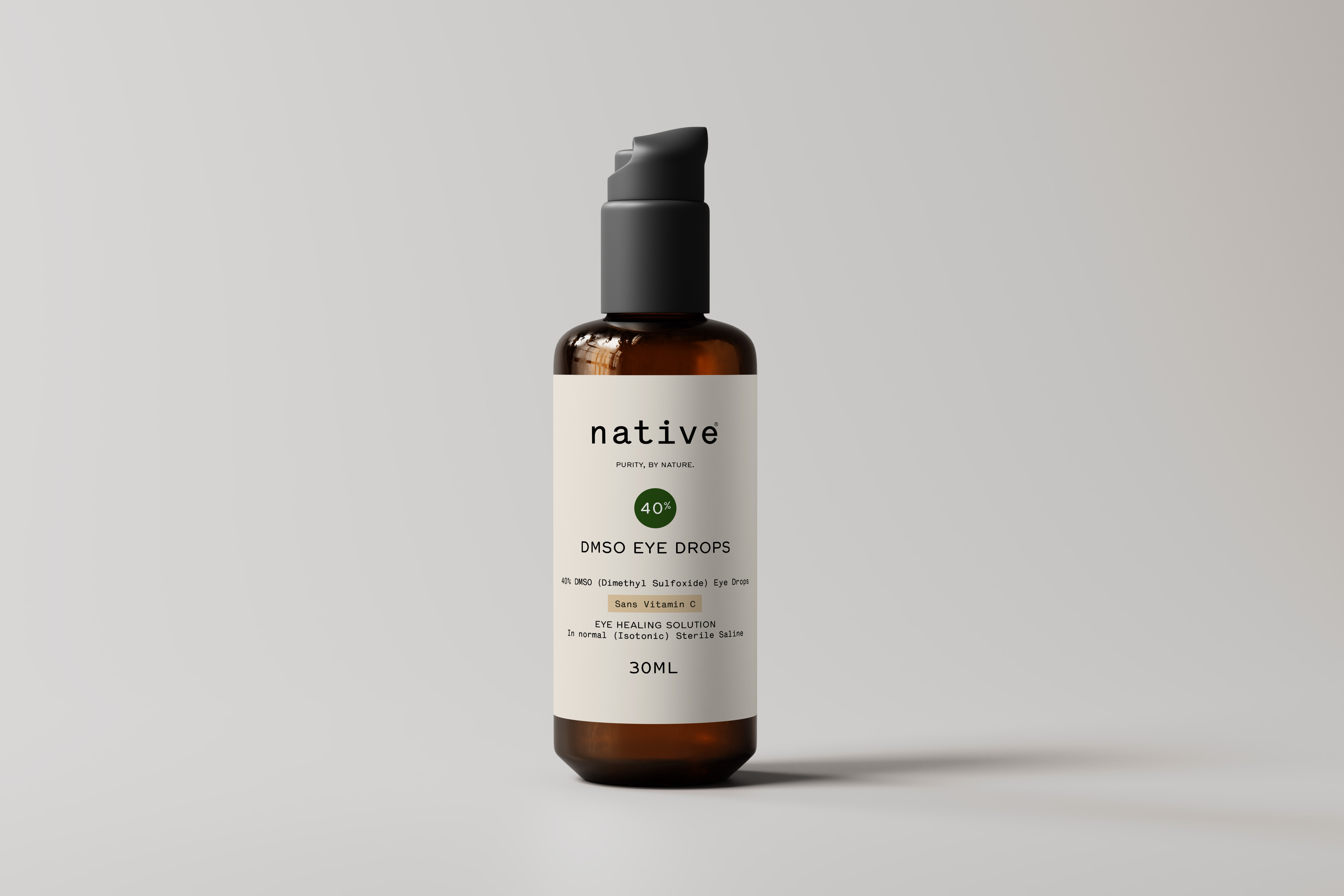
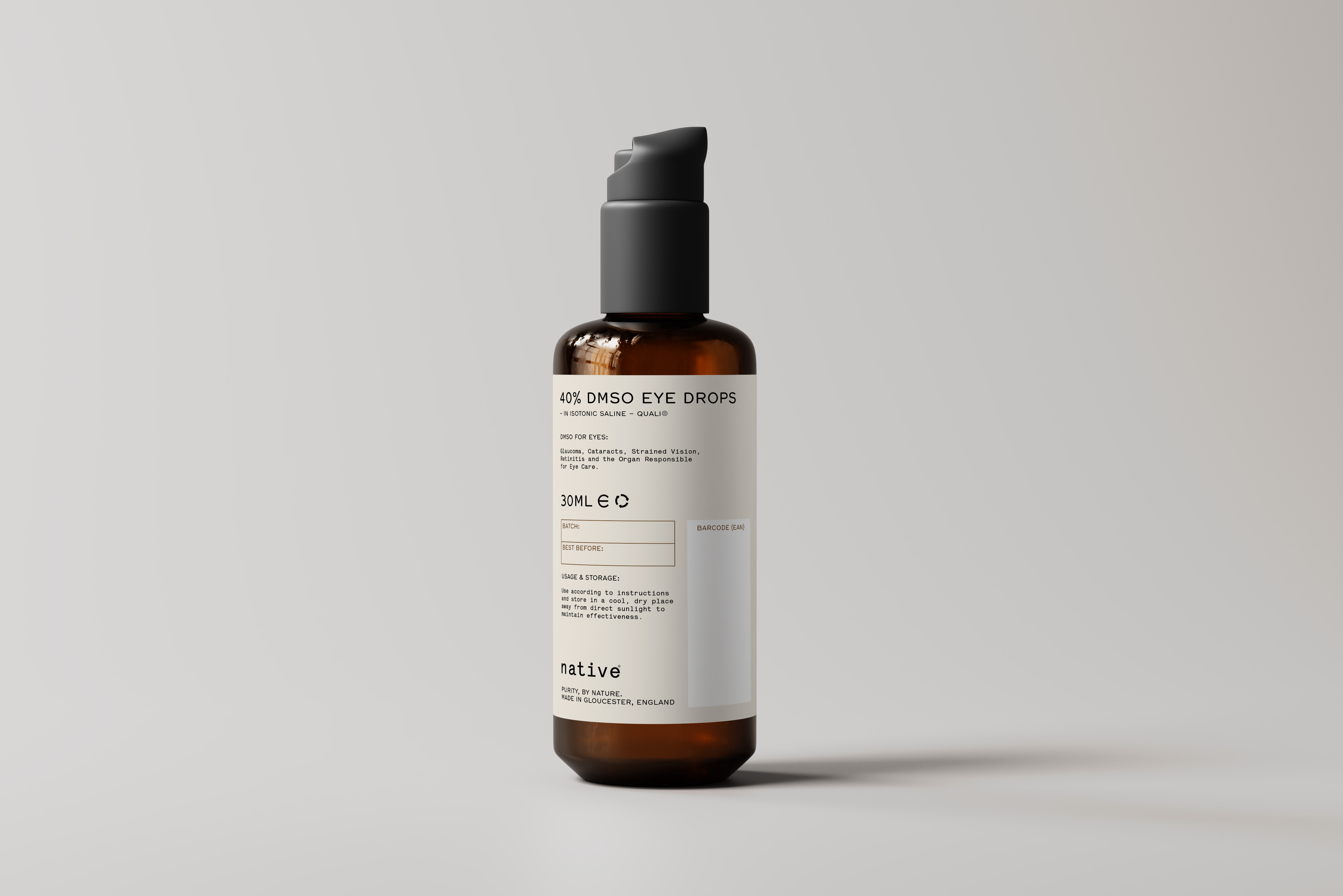
The DMSO Eye Drops were the test case for the system, because the product ships in more variants than any other — two strengths, each with or without added Vitamin C. Rather than design four separate labels, we designed one and let it flex. A coloured roundel carries the strength (20% and 40%), and a single highlighted tag flags the formulation, "with Vitamin C" or without. It means the whole range stays visually of a piece while each bottle is instantly identifiable, in the hand or on the shelf — and any future strength or formulation slots into the same framework without a redesign.
The result is packaging that looks at home next to a prescription, not a health-food supplement — which is exactly the reassurance the brand needed to reach a wider audience.
Client: Native
Any questions?
We’re just a click away.
If you would like to be added to the mailing list, enter your name and email below:
We are committed to protecting your privacy. We will only ever use this information lawfully (in accordance with UK data protection law, including the UK GDPR and the Data Protection Act 2018).